Ten best sign in UX features for your website
1 - The Sliding Sign in / Sign up form
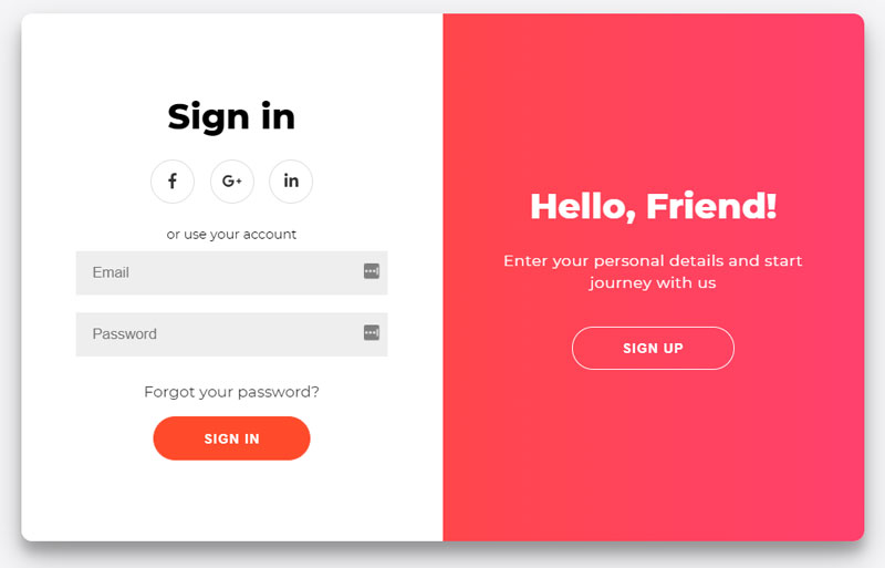
This neat Javascript and CSS sign in by Florin Pop allows the sign in and sign up page to interchange by sliding across one another depending on which the user needs. When a user comes to your site it's hard to know if they're an existing or user or a new one. Do you send them to /sign-in or /sign-up? With this solution you don't need to worry. Every user signs in or up on the same page.
The animation is slick and the css is stylish. The Javascript required is also very lightweight at just 11 lines of code with no dependencies.
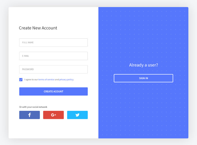
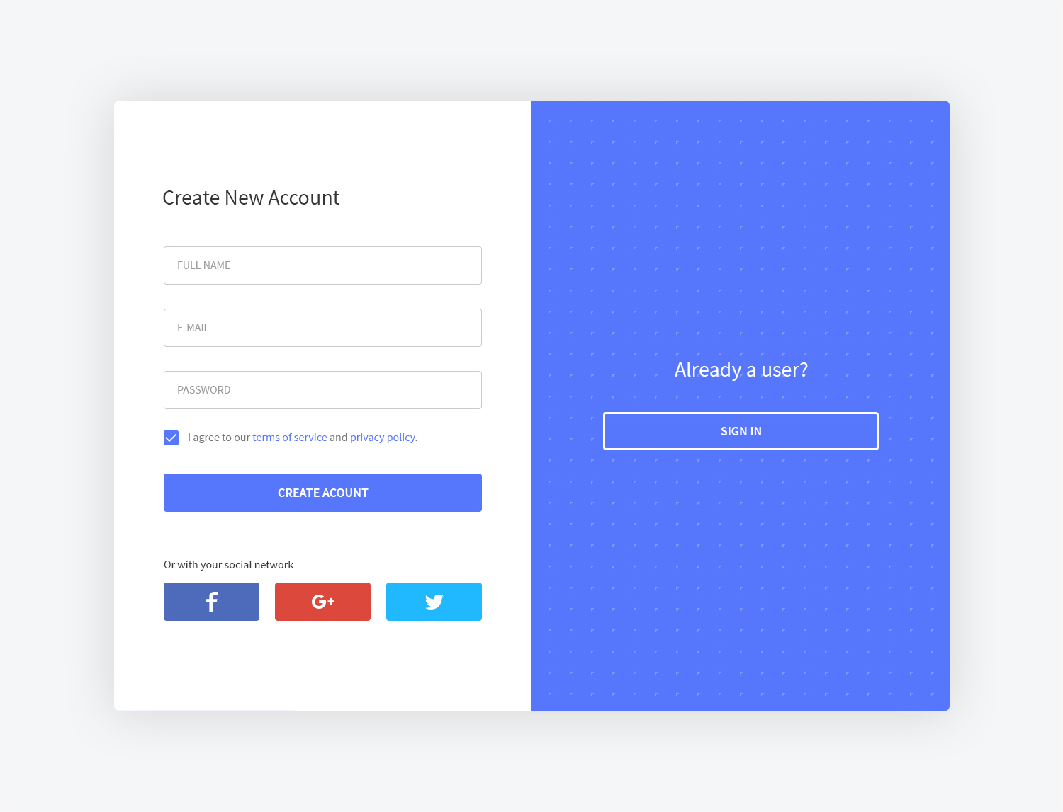
2 - Tabular Sign in / Sign up form
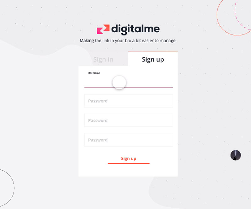
Continuing this theme, if you don’t like the sliding option, try the tab option. It’s a little more formal feeling which might suit a bank or an institutional website like a university for example.
Tabular sign in / sign up form by Chris Cannon.
Chris has created a very effective little form that is minimalist in style and easy to use. Not quite sure why he has three password fields on the sign-up form but the concept is strong.
If you’re using DID to authenticate, you don’t need to differentiate between sign in and sign up forms if you don’t want to. Simply ask the user to input their email address and DID will sign in an existing user or sign up a new one automatically. However, sometimes you need a separate sign up page to capture other information about the user or maybe ask them to accept some terms and conditions in which case, either the tabs or the sliding option is good user experience design for displaying both options.
3 - Animated Input Placeholders
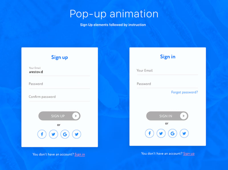
Labels be gone! I just love animated input placeholders like these by Leonid Arestov. They stylishly move out the way of your typing when you’re ready to fill in the form. They say a design is finished when there is nothing left to take away. Well, Leonid Arestov has achieved that because the form has no unnecessary clutter like labels or tooltips. Everything you need to know is in the placeholder. Some placeholders disappear when you start typing which is ok but you might forget what you’re being asked to input. This solution combines good user experience with minimalist design and I love it.
4 - Stylish Design
Sometimes there's just no substitute for style. Checkout ‘Login’ by Aryana Shakibaei. I don’t know what it is but I want in. The input spacing, invisible borders, cool grey, minimalist instructions and a single bright accent colour partner to create a sign in page that is very inviting. And to top it all, Aryana includes a natural, well lit photograph to reinforce the brand message for the underlying service. Where do I sign?!
5 - The Popup
A foolproof way to avoid disorientating your user is to sign them in right on the page they’re already looking at. Why navigate them away to some other page and leave the user frantically clicking ‘back’ to try to find what they were looking at in the first place?
Enter, the popup sign in. I particularly like this one by Vel Kumar. It’s quite a large pop up which gives space to do everything the sign in needs to do but it doesn’t completely fill the page. The designer also has the option as well to blur out the page content with CSS while the user signs in. This particular design also incorporates the sliding sign in / sign up form design so the user can choose between them.
6 - The Full Page Sign In
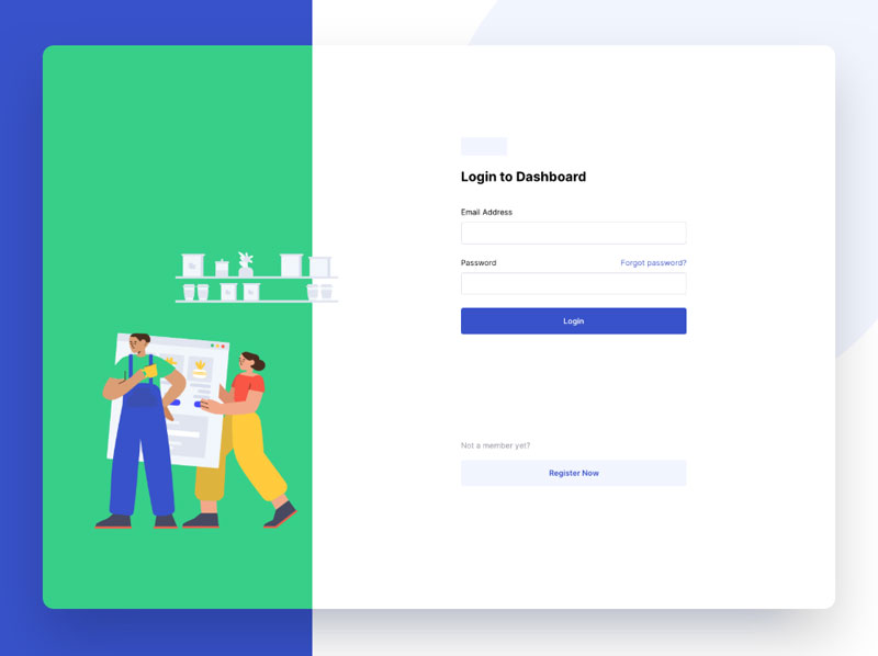
If you didn’t like the popup, try the full page instead. Block out all unwanted distractions and create a sense of space with the full page sign in. In this design by Mo’az Mohsen, there is ample white space around the form partnered with an attractive illustration and accent colour down the left hand side. I particularly like how the illustration escapes the background border to bring some life to the picture.
7 - Bright and Bold
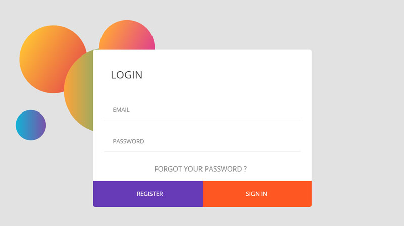
So many site themes are subtle these days so now for the antidote - bright and bold sign in. I just love the purple and orange palette used for the buttons, there can be absolutely no doubt what you’re being asked to click on. I also like that the ‘forgot password’ link is large and obvious too.
So often, the 'forgotten password link' is hidden somewhere on the page only to be clicked if you really can’t remember. It feels like admitting you’ve forgotten is somehow shameful and the link you need is made small and feint like it’s an awkward necessity no one wants to admit we really need. Well, not where Chouaib Blgn is concerned.
Forgotten? No problem, here’s the link, you can’t miss it. Of course, if you’re using DID’s passwordless authentication then you don’t need a password input field or a password reset option either.
8 - Dark theme
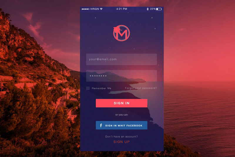
Dark themes are so on trend right now because they can reduce eye strain and draw on your device battery and this is one of my absolute favourites. It’s dark but it’s so much more than that. Eva Del Casale has found a background purple that when laid over an image with a transparency has an ethereal feel to it. The little stars twinkle and also note how the password box lines up with the horizon perfectly. Very clever. The choice of peach as an accent colour really works for me. It’s bright and clear to see and works so well with that purple. This dark theme works really well and doesn’t just conform to the bog standard white on black.
9 - One Field at a time
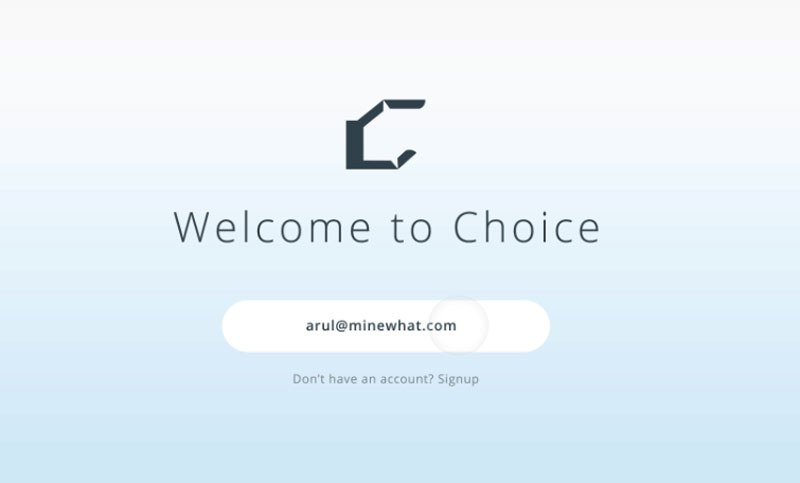
Sometimes, three fields in a list can be daunting and we all know that sign in is off-putting generally for users. This is a good workaround, instead of displaying all three fields at once, Arul Manikandan only shows the field the user needs at the exact moment they need it.
If you’re using DID for your passwordless authentication you’ll already know that DID only ever has one field anyway - email and if the user has setup device authentication, signing in is faster than ever.
10 - Humour
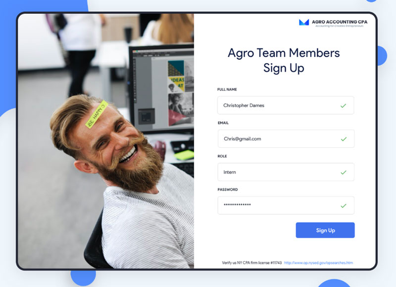
Last but not least, try adding a little humour to the mix. Signing in is tedious so make it more human. Be happy!